Sunday, July 19, 2009
Sunday, July 12, 2009
Week 9 - Deliverable 2
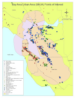 I chose to make a map for the 'exported image' required on this. Here, one layer of points of interest is enough to clutter the map significantly. I could have altered the size of each symbol to fit better but that would take a while and possibly affect future maps so I enlarged the area to fit the frame as much as possible and made do!
Week 9 - Deliverable 1
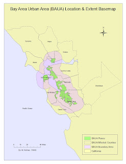 This basemap simply shows the extent of the BAUA area, the merged places polygon and the counties the BAUA affects. The only label necessary was the county name as the others are described in the legend. I made the sea area blue by coloring the background of the data frame but this also affects the land colors too. How do you make the map extent lay on top of the background color?
Tuesday, July 7, 2009
Week 8 - Deliverable 4
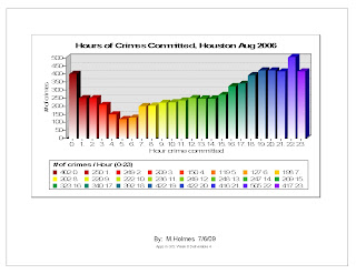 Times of crimes graph: I love the rainbow colors and the gradient shading of this graph but I did have annoying little problems with it. The hours in the legend are close to the numbers - does anyone know if there is a way to customize the legend beyond the wizard?
One problem I did solve however that may help YOU was this: the x-axis would have missing hour numbers - they appeared after I went back into properties and reselected Ascending and Apply a few times. Very strange.
Week 8 - Deliverable 2
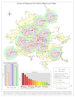 Police substations: I decided to include the buffers because I think it is relevant to the substation decision. I also included the graph but it clutters the map just a little. The Police Station crimes graph is color coded (with tongue in cheek!)to represent large numbers of crime (in red) to stations dealing with low numbers (in green). This is fine of course for quantitative data like this but doesn't represent the population of the surrounding area nor other factors for higher crime figures.
As the 3 highest stations were in a row in the south of the city, surely a fourth could be built nearby to share the load?
However, these 3 stations may have more personnel than the others to deal with them so the figures may mislead. Is this map lying?
Week 8 - Deliverable 1
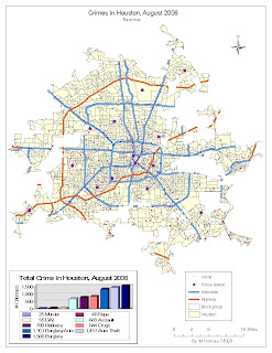 Basemap: For the roads, I only included the top 2 major roads types. I couldn't quite see the point in including the census blocks. As for the graph, I don't know of any way to manipulate the graph to design the text and legend better other than the basic options in the wizard. If anyone knows, please share!
Subscribe to:
Comments (Atom)


