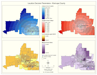
I changed the legend slightly to ensure that the highest 5 ranks had the same color symbol so that they could be compared, because I zoomed in a little making 2 colors redundant. I couldn't quite word the pros and cons the way I was thinking it but ultimately, if the clients respecify the criteria as in this case, then that dictates the result, doesn't it?
Monday, June 22, 2009
Saturday, June 20, 2009
Week 6 - Deliverable 2
I decided to present the maps as seamless as possible, that is, appear to have the four maps integrate as one by not having a title in each frame and referencing each map with contrasting legend colors for easy identification and have one central legend.
Tip: Use only one scale bar for all four maps by setting the scale of each data frame to the same value then create a scale bar from any frame you like.
Sunday, June 14, 2009
Week 5 - Deliverable 4
To create this map I did the following:
(1) Exported the image from the sxd to the Visual.mxd as a Jpeg.
(2) Created the legend as normal after changing the layers' symbology on the mxd to be the same as the ones from the sxd.
(3) Inserted the north arrow then rotated using Data Frame Tools toolbar to about 53 degrees.
I don't believe you can assign a scale to the map except possibly state a distance between the limits of the map feature.
Tuesday, June 9, 2009
Week 4 - Alternate Deliverable 2
I decided not to include the 1993 flood layer; only that part of the parcels affected by the flood. This does skew the stats a little given that the most expensive parcel is way more than the rest but is affected by only a very small area of its parcel.
Here's a Legendary tip: Stop wasting time fumbling around the legend properties - just whizz through the wizard and when done, right click the legend and "Convert to graphics". Use Group and Ungroup to enable each individual element of the legend to be messed with. Play with it for half an hour and you'll soon be an expert. I do all my legends this way! E-mail me for more details.
Week 4 - Alternate Deliverable 1
Monday, June 8, 2009
Week 3 - Deliverable 4
I liked this map because it is simple looking but demonstrates in appropriate detail the affected roads and hospitals. The health facilities seemed to be on the edge of the flooded areas and safe (but possibly stranded) except one in Jackson county. The highways and interstates were clearly affected.My major pain is never being able to label the major roads appropriately, however, since the highways and interstates are clearly and separately shown in the legend, I thought the message of the map was delivered, although actual road numbers are not shown.I used the Hospital symbol from the menu and chose a 3-d image from Buildings for the church but the effect doesn't really impress on this map because of the limitations on the size of the church symbol.
Week 3 - Deliverables 2 & 3
I didn't have any problems creating this map, again from precise instructions except that I couldn't work out how to manipulate the graph where the text was in the same font and size. The text labeling on the x-axis displays only 2 values - strange. It shouldn't matter though because the legend to the graph clarifies the colors.
I did not use symbols other than plain colors that contrasted each other as this time there was no conflict with underlying layers.
TIP: Island names obscuring the island detail? Easy fix:- Go to Layer Properties - Labels - Symbol - Properties - Y Offset and set to -13 then OK,OK,OK.
I did not use symbols other than plain colors that contrasted each other as this time there was no conflict with underlying layers.
TIP: Island names obscuring the island detail? Easy fix:- Go to Layer Properties - Labels - Symbol - Properties - Y Offset and set to -13 then OK,OK,OK.
Week 3 - Deliverable 1
My first map was simple enough to create having followed the precise instructions, however, the challenge for me on this map was the colors and symbology. The intense blue gave the illusion of water but was not strictly true as it included low land. Symbolizing polygon layers would conflict with the elevation color - transparency would change the color too so I selected the marsh symbol that covers the blue; you can assume a low elevation (blue) for this anyway, right?
Also, it makes sense to color the rivers blue but this also conflicts - too bad! You can make out the different shade of blue for the rivers and for me no other color came close to showing the dramatic network of rivers - purple just didn't cut it.
Tip: use as much predefined symbology from the menus for features as possible - ESRI has a ton of them if you have the time to look them up!
Subscribe to:
Posts (Atom)