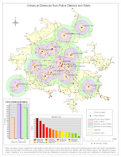
 Police substations: I decided to include the buffers because I think it is relevant to the substation decision. I also included the graph but it clutters the map just a little. The Police Station crimes graph is color coded (with tongue in cheek!)to represent large numbers of crime (in red) to stations dealing with low numbers (in green). This is fine of course for quantitative data like this but doesn't represent the population of the surrounding area nor other factors for higher crime figures.
As the 3 highest stations were in a row in the south of the city, surely a fourth could be built nearby to share the load?
However, these 3 stations may have more personnel than the others to deal with them so the figures may mislead. Is this map lying?
No comments:
Post a Comment